primeworks studios
First big branding project. I was contacted by soulutions to draw up some draft brand design for a new local content production studios own by Media Prima.
One of my drafts got selected and made its way to become a strong brand for primeworks studios sdn bhd.
Worked closely with Soulutions Brand Communication Agency Sdn. Bhd. (Rishi and Peter) on this project.

client : primeworks studios mediaprima (malaysia) primeworks.com.myagency : soulutions brand communications agency soulutions.com.mytask: logo and brand designugendran letchimenan 2008

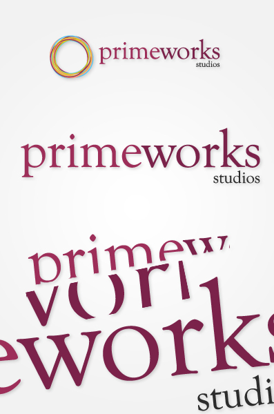
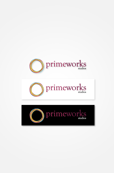
This iconic part of the logo serves two functions, either to stand by itself, or to be portrayed together with the wordings. The Circle in reality represents the conventional viewfinder of a camera that focuses and provides a point-of-view into the new-age feel of the company. The importance of an icon is seen in its gravity, and the Circle herein is a good representation of a company that leaves an evocative memorable feeling to its patrons.
The colours are vibrant, which marks that something new, different, and fresh is in the air. In brief, it represents the aspect of Prime, which renders as an important facet in the name of the company.
The colours are vibrant, which marks that something new, different, and fresh is in the air. In brief, it represents the aspect of Prime, which renders as an important facet in the name of the company.